Pino Pascali - The Graphic Behind the Artist
A multi-faceted artist spanning from graphic design to exhibiting at the Venice Biennale, Pino Pascali in just 10 years of career managed to create an impressive body of work that makes him one of the most unique and fascinating Italian pop artists of the 1960s. We talked to Claudia Lodolo – painter and daughter of Pascali’s collaborator Sandro – about the artist’s intimate life and his lesser-known but extremely valuable and pioneering work in advertising with Lodolofilm.
There is a series of photos capturing Italian painter, sculptor, and graphic designer Pino Pascali lively arguing with a group of people, students and journalists, at the 1968 Venice Biennale. It you didn’t know how Pascali looked like, you would misplace him for a pop star, or a playboy. Sunglasses, a paisley necktie tucked inside a corduroy overshirt, a pair of thick sideburns in the fashion of Joe Cocker and long, curly hair as wavy and untamed as his restless creative attitude.
For Pascali, born in 1935 in Bari, Puglia - Southern Italy - from a working-class family, getting to one of the World’s most prestigious arts exhibitions was the achievement of a lifetime, the result of 10 years of constant and diversified production. That’s why Pascali was captured arguing at the Biennale. He didn’t want to withdrawn his works despite the pressure of a multitude of students who had gathered in Venice - following the spirit of Paris May ‘68 riots - to protest the elitist nature of the arts.
Pascali, who had come from the bottom, had very little to share with the protesters’ signs that seemed to address more the police than the Biennale itself. One read ‘1964: Pop-Art / 1968: Poliz-Art’, referring to the pivotal role the 1964 Biennale played in affirming Pop Art on a global scenario, contributing to shape a generation of Italian artists, including Pascali.
It was in fact in those years of transition from Arte Povera to Pop Art that Pascali built a name for himself in Rome, where he had moved in 1956 to study at Accademia delle Belle Arti, the city’s fine arts academy. Here, thanks to the visionary guidance of lecturer Toti Scialoja, students were introduced to the latest avant-garde trends from America and shown exhibitions at art gallery La Tartaruga, located nearby the Accademia. Pascali was therefore familiar with the flamboyant and stimulating environment of the Piazza del Popolo scene, where he bonded with the likes of Mambor, Schifano, and Tacchi.
Pino Pascali sat between collaborators photographer Franco Di Stefano (left) and Sandro Lodolo (right) in a Roman trattoria, 1961. Claudia Lodolo archives.
Whilst working as a painter and sculptor, though, since the late 1950s Pascali developed a distinctive career in graphic design with Rome firm Lodolofilm (also known between 1957 and 1961 as Studio Lodolo, and as Studio Lodolo-Saraceni between 1961 and 1964) that did not run separately from his Pop Art production, but that fascinatingly intertwined with it. Claudia Lodolo - painter, writer, and daughter of Lodolofilm’s founder Sandro - has spent many years of her life trying to re-discover the graphic design side of Pascali and to attribute, along the archival work of Florence Fritelli Arte Contemporanea gallery, more dignity to his too often wrongly dismissed career in advertising.
“Pino and Sandro accidentally met in 1958 at Safa Palatino, a firm that produced graphics and title sequences for TV and cinema,” tells Claudia. “My dad already worked in advertising, while Pascali had just come out of Roma Accademia delle Belle Arti. They bonded because my dad had a car, whilst Pascali didn’t, so he asked for a lift. Sandro, who was looking for people to join his studio, then, noticed Pascali’s style and realised how similar their artistic sensibilities were. So they clicked and got on straight away.”
Pascali and Lodolo worked together for 10 years, between 1958 and 1968, when the first suddenly and tragically passed away in the aftermath of a motorbike crash.
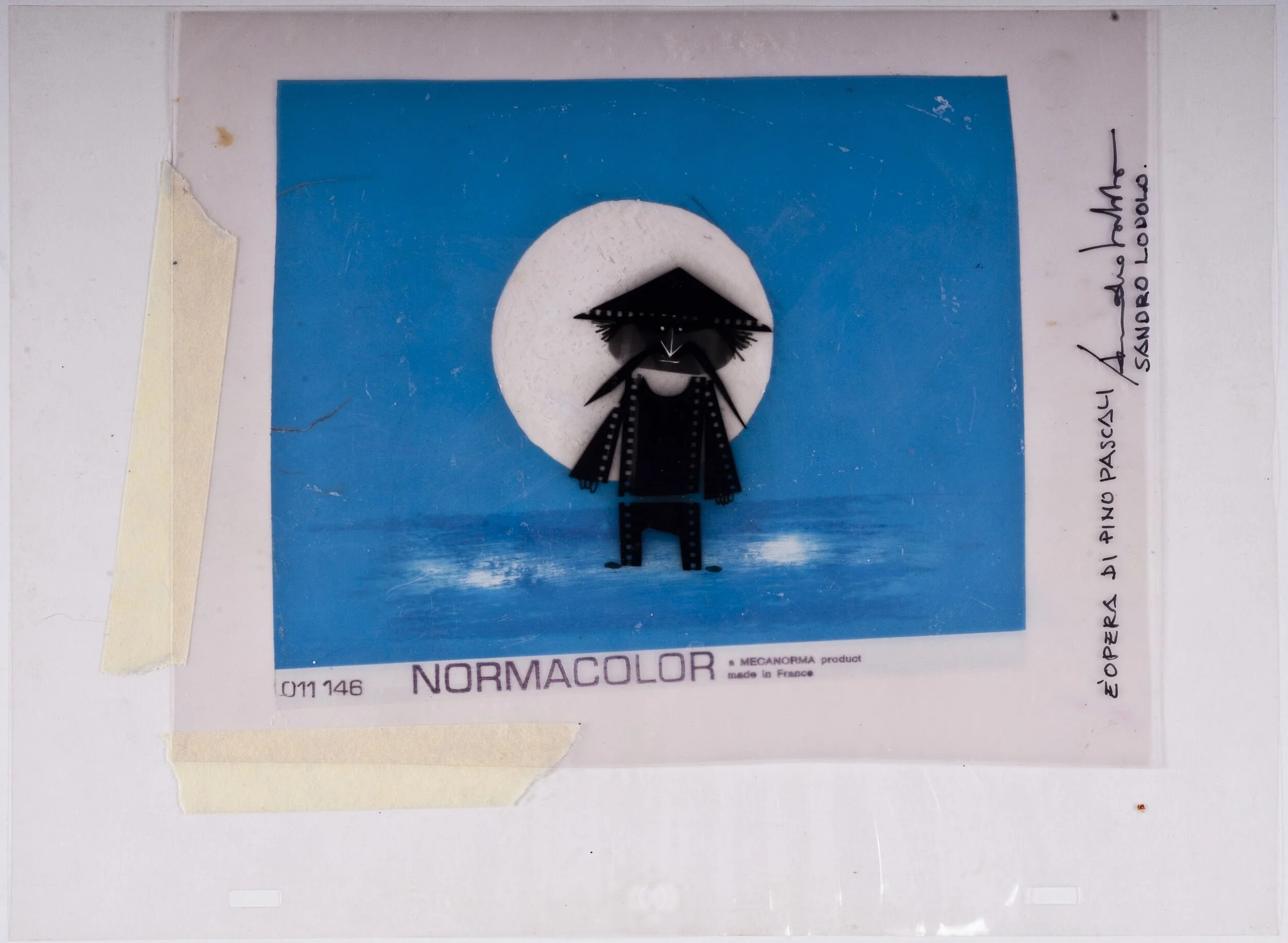
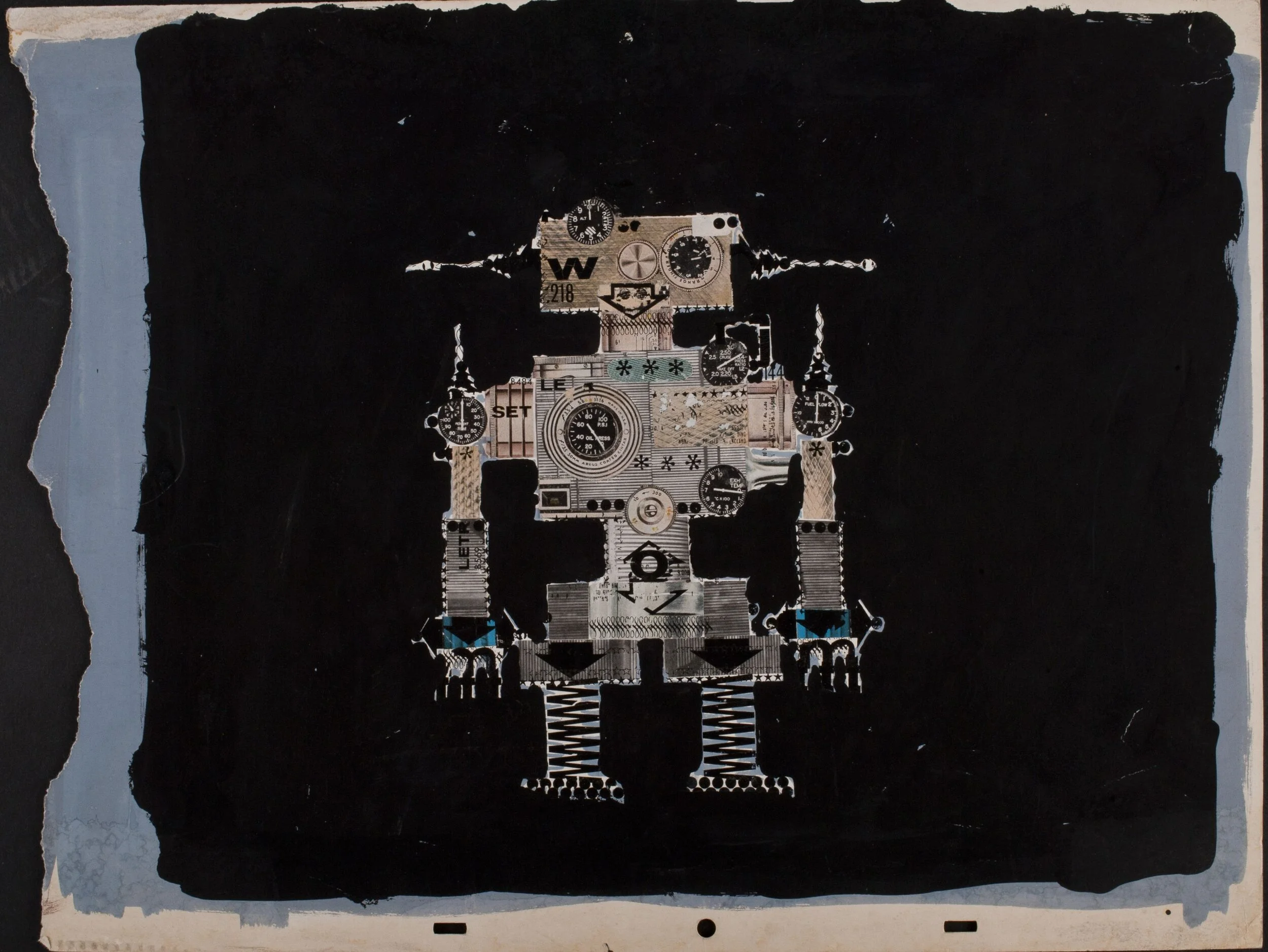
Animation slide by Pino Pascali and Sandro Lodolo. Claudia Lodolo archives.
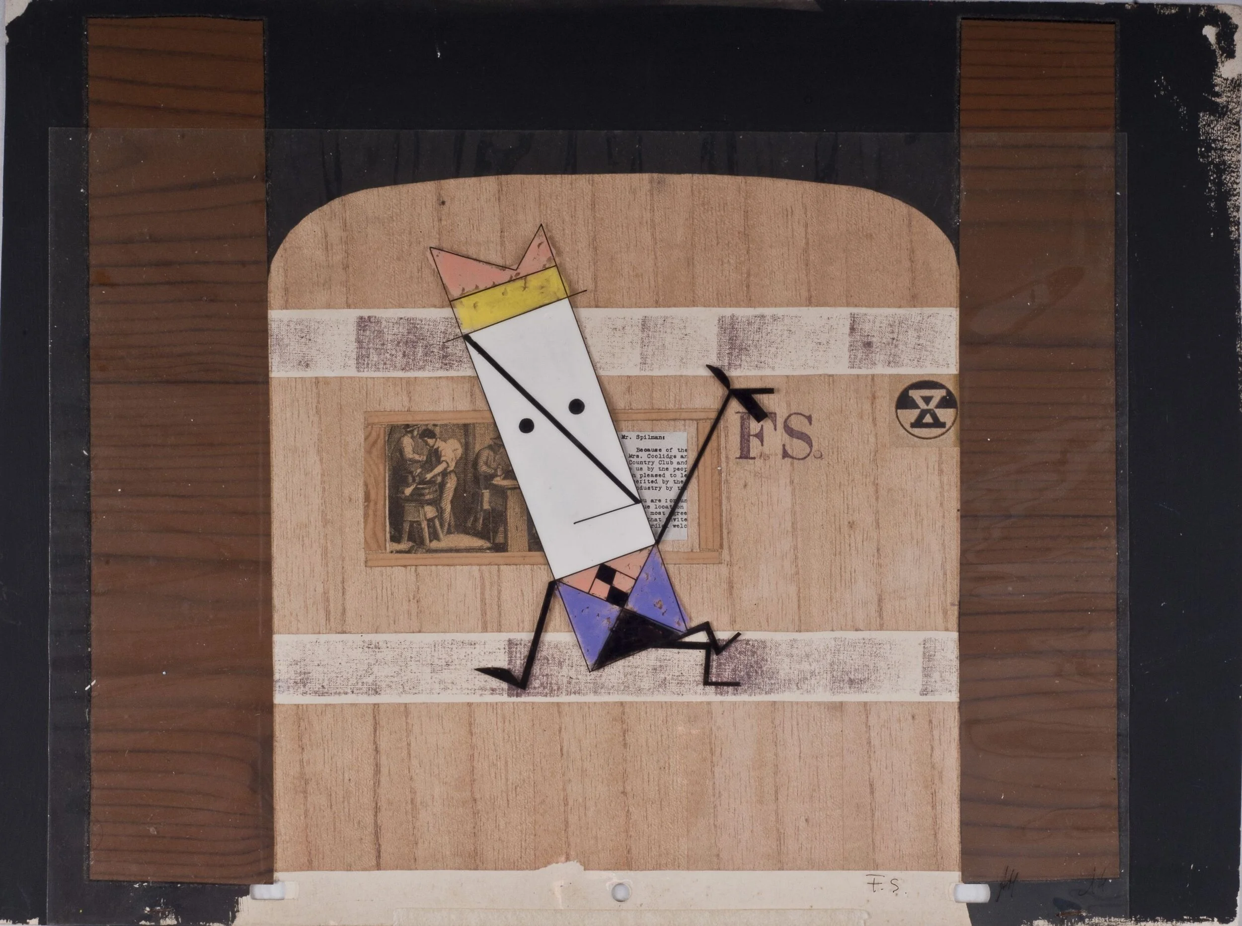
During this time lapse, the volcanic couple collaborated on a hefty number of adverts, mostly for Rai, the Italian state television, that by then only had one national channel. Despite also working on TV show title sequences, they mostly created motion graphic adverts for a variety of brands – from Algida Cornetto ice creams to Cirio tomato sauce. These were featured in Carosello, a 10-minute advertising show that was broadcast daily between 1957 and 1977. This commercial break was itself a major TV show that was used both to entertain families and to advertise products.
“Back then there was a consistent use of animations on the television, so there was a big request for drawers and graphics. Carosello had this rule that each commercial could only be shown once. It follows that the creative output was constant and massive. It’s at this point that my dad realised that the person he had hired in his studio was a total and complete genius.”
Pascali, in fact, wasn’t just a graphic designer with a distinctive trait, but also a volcanic mind that would come up with endless ideas and slogans. He was particularly good at finding the puns that linked the commercials’ narrative part with the advertising one. By law these commercials couldn’t be totally explicit about the product, but they had to provide a form of entertainment for most of the airtime available and only drop the advert towards the end.
Pascali and Lodolo’s graphics for a Ferrovie dello Stato - Italy’s national railways - advert. Claudia Lodolo archives.
“For example, they produced 16 Spanish corrida-themed adverts for Algida Cornetto ice creams, using the analogy between the ice cream’s shape and the bull horns to create the story link. They’d always have a laugh in the studio, Pascali had the perfect mind for the job.”
This very same pun-loving approach was used by the artists in many other of his works not related to advertising. “His sculpture Il Muro del Sonno (The Wall of Sleep) - a massive panel with a series of pillows attached to it and disposed like bricks in a wall – revolves around a pun about the wall of sound (‘muro del suono’ in Italian). I believe that the whole work is based on the assonance between ‘sonno’ (sleep) and ‘suono’ (sound). Furthermore, in his Southern Italian dialect both words sound very similar, ‘‘o suonn’”, enlightens me Claudia.
It is with the very same spirit that Claudia titled her book about Pascali 32 Anni di Vita Circa (Aproximately, 32 Years of Life), named after the artist’s 32 m² di Mare Circa (Approximately 32 m² of sea) sculpture.
What surprises about Pascali is that his job in advertising was strictly motivated by financial needs. Nonetheless, his production burst with creativity, joy, and passion. “Many Italian critics see this side of his production as something diminishing to his career, but I don’t think it’s the case because he was yes moved by financial needs, but he still operated in an artistic and creative field. He didn’t simply take on the first manual job available.”
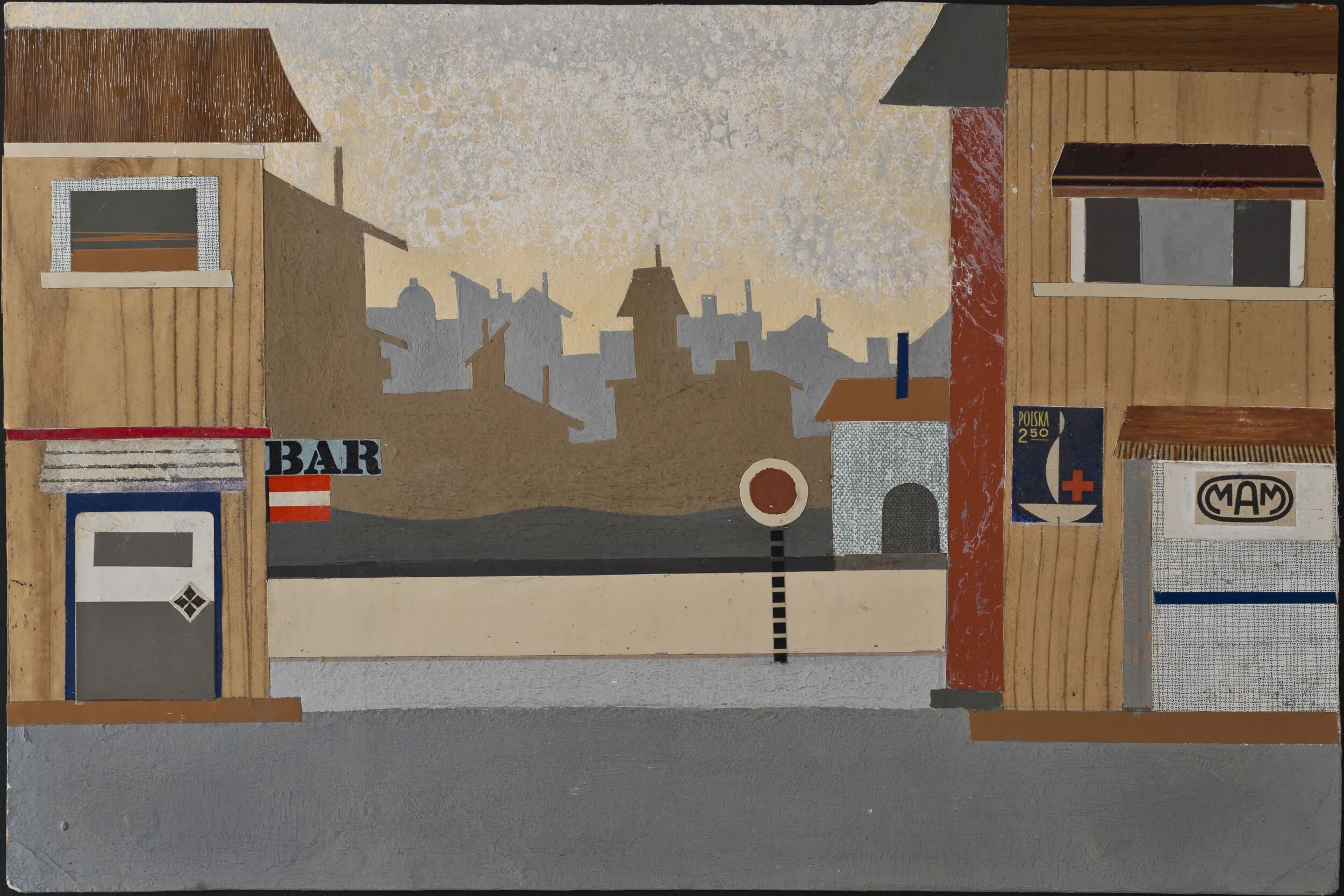
Drawings for the scene of unreleased animation short film I Killers. Claudia Lodolo archives.
Claudia’s work of documentation of this lesser-known side of Pino Pascali contributed to a re-evaluation of his production for Lodolofilm. Advertising and television, in fact, back in the 1960s were something distinctively pop and fascinating that captured the attention of many professionals, from graphic designers and artists, to film directors, actors and thinkers.
“Think that there were many prestigious advertising awards. One of the most creative and iconic firms in Italy in those times was Armando Testa, in Turin. Painter Michelangelo Pistoletto worked there early in his career, and he told me how pivotal advertising has been to the development of his style. He was, in fact, an academic painter until advertising put him in touch with modernity and changed his trait into what we now know as his trademark style.”
Pascali’s two artistic pathways cross multiple times, also because he never had periods, his production was simultaneously diversified in many areas like sculpture, painting, graphics, and animation. “He actually used different works to constantly expand his studies and production,” explains Claudia, “When in 1964 my dad commissioned him to venture to Naples and Capri to shoot some photographs for a Cirio tomato sauce advert, he came back with hundreds of photographs, many of which had no use in the commercial. However, in some of his later works analogies with these shots are to be found.”
Not only Pascali experimented with several techniques, but also with materials. They, along with tools such as hammers and hand saws, held a symbolic value for the artist, because they connected him to his rural and working-class upbringing in the Southern Italian region of Puglia. An example of such roots-inspired creativity can be traced down in his 1mc di Terra, 2mc di Terra (1m3 of Land, 2m3 of Land), two black cubic blocks hung to the wall that resemble soil in their texture.
As argued by Claudia, these cubes were Pascali's own interpretation and response to American Pop Art re-working of commodified everyday life goods. Similarly to what Tano Festa said about his From Michelangelo series, Pascali turned what to him was the ordinary – land soil – into art.
I Postero’s, 1966 / I Due Pittori (Two Painters), 1963. Frittelli Arte Contemporanea archives.
This attachment to his roots had to be traced down in Italy’s discriminatory view of Southerners, the so-called ‘terroni’, a slang term coined by Northerners to indicate those who in full post-WWII economic boom still worked the land. According to the memories collected by Claudia, Pascali wasn’t targeted by his university mates or called out by Roman locals for being a Southerner, but he felt a sense of inferiority himself.
“Especially when he first moved to Rome,” explains Claudia, “he was still very much dressed like a good Catholic provincial boy. His fellow artists told me he would still often wear a tie on a Sunday, or sport well-pressed trousers. He was unnecessarily timid, and although he already showed signs of his creativity, he was still partially held back by his upbringing.”
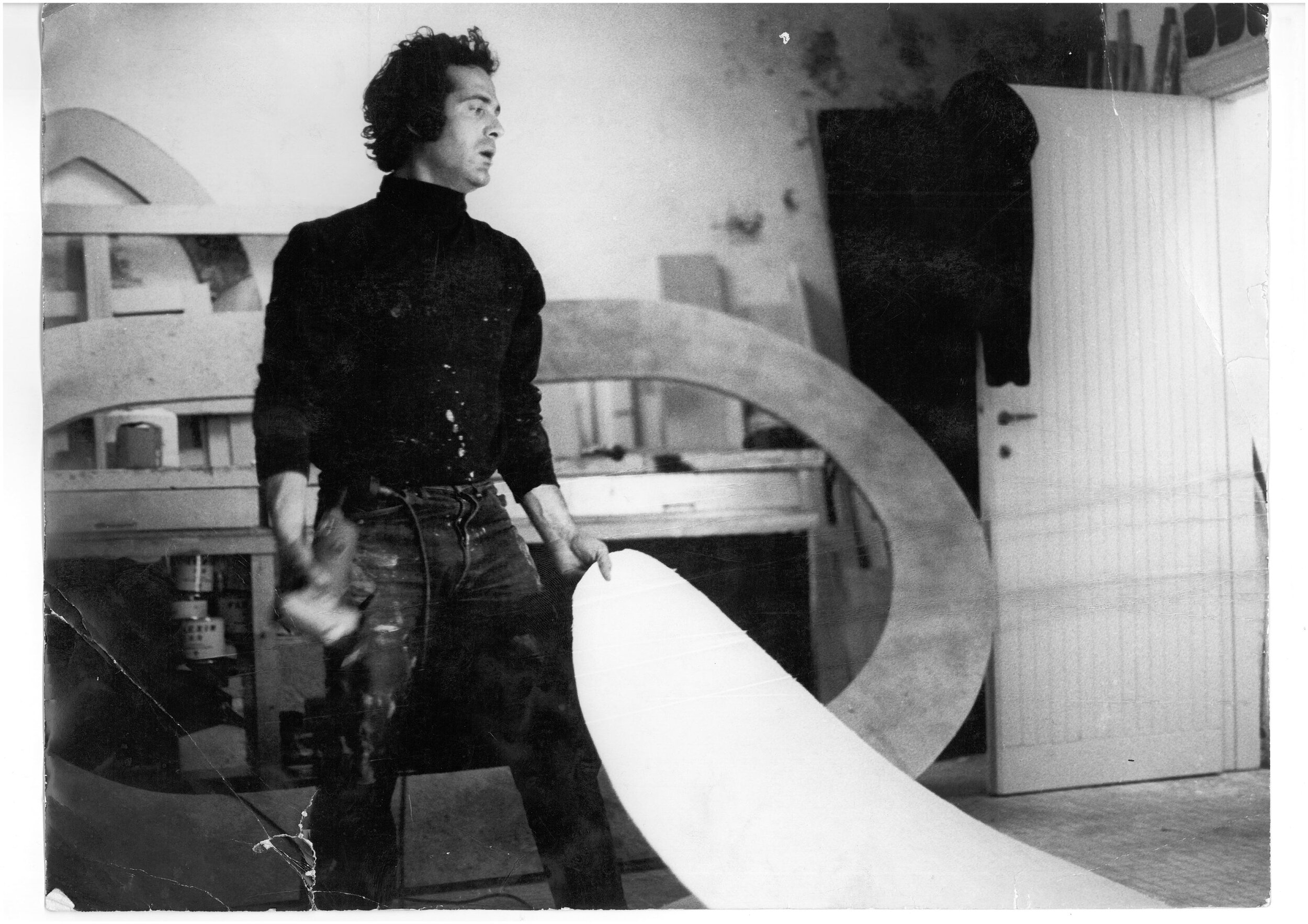
Surely the Pascali shot in his studio by his photographer friend Marcello Colitti, or the one who took part to 1968 Venice Biennale exhibition, was a different, more confident person, at least on the outside.
Pino Pascali shot in his studio that resembled a neat garage by Marcello Colitti, 1968. Flavia Colitti.
Pascali’s volcanic creativity was, however, matched by great discipline and tidiness. “As remembered by his Accademia fellow Salvatore Venditelli,” explains Claudia, “when Pino moved out of their shared flat in Via Dell’Orso, his new studio-flat was suddenly incredibly tidy, with all the work tools geometrically hung to the walls, similarly to a garage.”
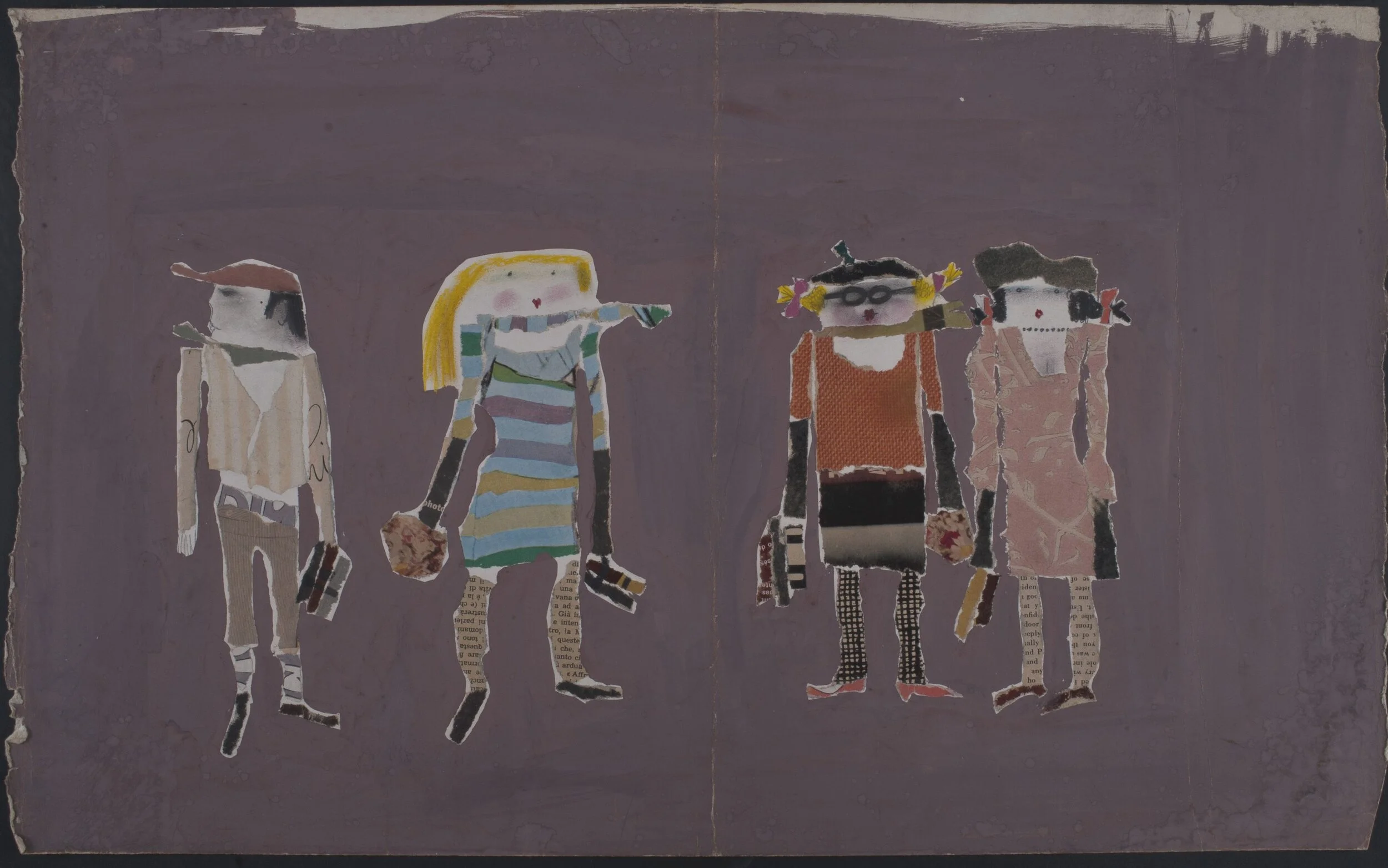
Geometry was indeed a defining trait of Pascali’s style. This could be observed, for example, in the unreleased short-film I Killers and in the series of I Postero’s for Rai second channel’s Intermezzo, a break sequence broadcast in-between shows.
“I Postero’s show Pascali’s orthogonal trait,” says Claudia. “When he first showed the draft to my dad, they were so basic, just simple rectangles with a pair of eyes, that he asked Pino to add something to them. When he came back, he had simply drew a heart. This says a lot about Pascali’s irony and the creative freedom he and my dad enjoyed in the studio.”
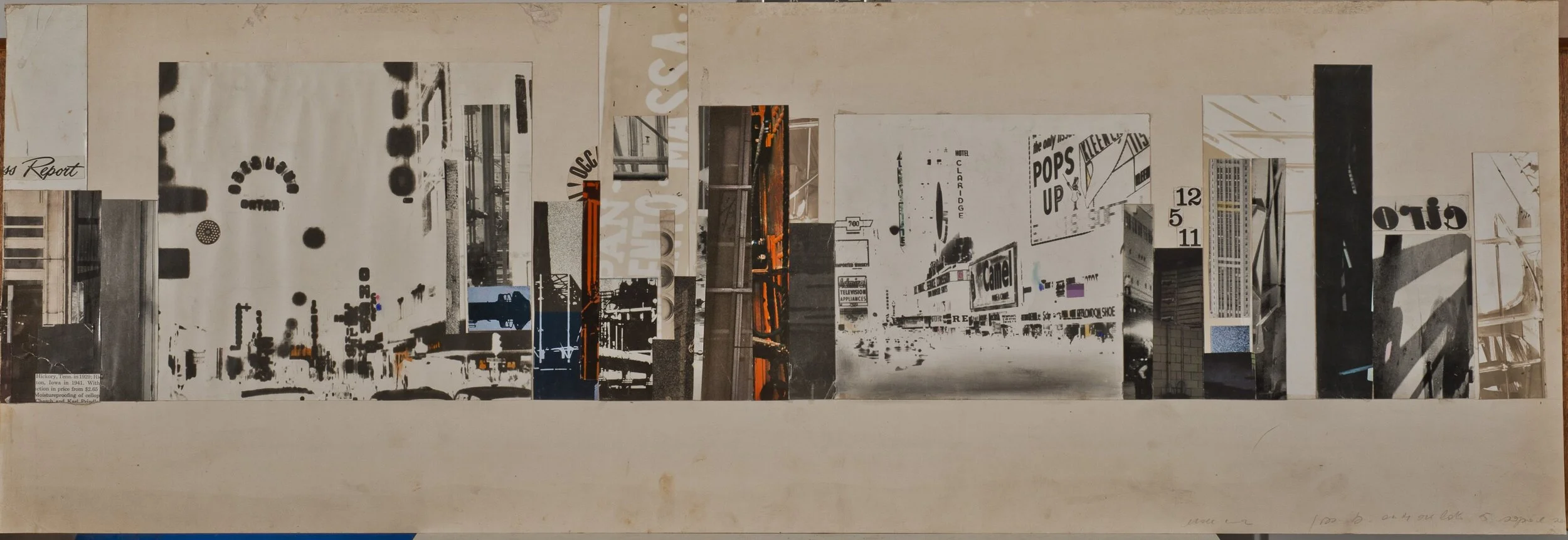
Pascali’s advertising works constantly mixed, with a playful twist, the Art Povera style and his penchant for pop. Claudia Lodolo archives.
Witnessing Lodolo and Pascali’s playfulness, that should not be mistaken for superficiality, are two of the most iconic photos of the couple. Placed in early 20th century-style oval frames are two black and white portraits that see the artists with waxed moustaches, sporting a black suit, tie, and bowler hat. The snapshots were born out of Pascali’s witty observation that Lodolo Film studios had to display portraits of their illustrious predecessors, just like lawyers did in their offices.
Despite the ironic nature of the photographs, they nonetheless shared an artistic sensibility with the broader European spirit of the times that mirrored Swinging London’s love affair with 19th century, 1930s (see I Killers, for example) and Far West aesthetics.
It was such artistic zeitgeist that in the first place inspired Lodolo to open his advertising firm, and to then professionally and personally bond with Pascali, whom he shared his pop and mid-century trait with.
The mock ancestor portraits Pascali and Lodolo created for their offices. Frittelli Arte Contemporanea archives.
As told by Claudia, “my dad never studied to become an artist. After completing his studies, he took a course in billboard advertising, and started forming his graphic skills by himself by spending his days drawing the ancient roman statues around the city in all their smallest anatomic details. When one day at the cinema he saw Saul Bass’ opening titles for [Otto Preminger] Anatomy of a Murder, he decided he wanted to open his own studio to do those kinds of works.”
Despite the growing popularity of Pascali as an artist, he kept collaborating with Lodolo, showing that advertising was more than a bread-winning job to him. “It was actually my dad who at some point, when Pascali started receiving important commissions and invitations to exhibit his works, told him he could leave the studio to focus on his art.”
Whether Pascali would have ended up leaving Lodolofilm is not to be known, as a tragic road accident took his life prematurely in September 1968, just a few months from the showcase of his works at the Biennale. However, what is certain is that with his career in advertising Pino Pascali left an outstanding artistic legacy that tells loads about his creative, fun-loving, and flamboyant attitude to life.
Pino Pascali shot by Marcello Colitti, 1968. Flavia Colitti


